
Data visualization is key to obtaining value from your data. Especially with the massive data sets typically stored in a time series database (TSDB), it’s essential that you have interactive visualization tools to provide a graphical representation of your data. With a good visual display of your data sets, key decision makers have everything they need to make business decisions and obtain the most value from those data sets.
This article introduces four popular data visualization tools that you can use to obtain a visual representation and enhanced understanding of your data. All four tools support integration with different database management systems, so you can use them with your time series DB as well as with an RDBMS.
Top Data Visualization Tools
Grafana
Grafana is a popular open-source tool for data visualization. It offers customizable dashboards that you can use to monitor your data in real time. You can download premade dashboards or design your own from scratch to achieve a visual display of your key metrics. The main benefits of Grafana are as follows:
- Web application that’s easy to deploy and use on many platforms
- Compatibility with a wide variety of data sources
- Cloud and on-premises options with free and paid account types
- Open-source software
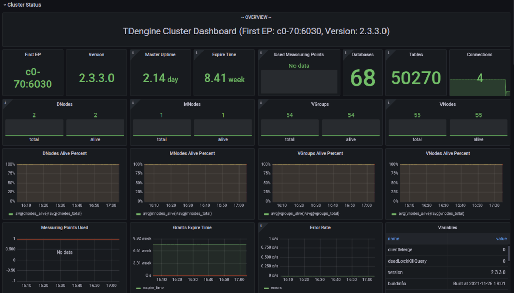
You can easily integrate Grafana with your TDengine deployment by using the official plug-in for TDengine. The TDengine documentation also includes a step-by-step procedure for visualizing your time-series data with Grafana.
For more about Grafana, see the official website.
Google Data Studio
Data Studio is a free data analytics platform developed by Google. In Data Studio, you can create customizable dashboards and reports to display your data any way you want. The main benefits of Data Studio are as follows:
- Compatibility with Google and third-party products through connectors
- Good variety of visual display elements, such as pie charts and bar charts, that you can use to create your dashboards and reports
- Easy collaboration with other team members
- Free to use

You can use the TDengine connector to add TDengine as a data source in Google Data Studio and create dashboards using your data. The TDengine documentation also includes a step-by-step procedure for connecting your TDengine data with Data Studio.
For more information about Google Data Studio, see the official website.
Microsoft Power BI
Power BI is business intelligence and reporting software produced by Microsoft. With Power BI, you can import data and transform it to obtain the visual display that makes it easiest to understand. The main benefits of Power BI are as follows:
- Very strong data transformation capabilities by means of the Power Query feature
- Integration with other products in the Microsoft Power Platform
- Data security capabilities for sensitive data
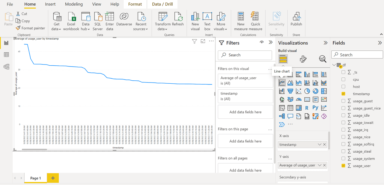
Developers can connect and send TDengine data to Power BI via a Python script or other methods.
For more information about Power BI, see the official website.
Tableau
Tableau is data visualization software produced by Salesforce. By using Tableau, you can easily create visual displays of even the largest data sets. The main benefits of Tableau are as follows:
- Interactive data visualization components from bar charts to heat maps that enable quick and convenient report creation
- Strong community for product support
- High performance for large data sets

For more information about Tableau, see the official website.
The four products discussed in this article are all excellent choices for performing data visualization due to their rich feature sets and compatibility with many data sources. The TDengine Team is always looking for new opportunities to enable interoperability with other ecosystem components, including data visualization platforms and software, and to introduce useful data-related products to our users.


